
As part of the Datawise London Data Talks series, Oxford Consultants for Social Inclusion (OCSI) led a session on understanding unemployment figures and what the statistics look like for London.
You can watch a recording of the talk here
Read the accompanying resource on the OCSI webiste - A guide to unemployment data.
And delve a bit further into the data for London in this guest blog from OCSI here.
Unemployment in London
To begin with, let’s look at the current unemployment rates across London and each of the boroughs, based on JSA & Universal Credit statistics for the month of November. (Data is published monthly, all figures were correct at the time of the presentation.)
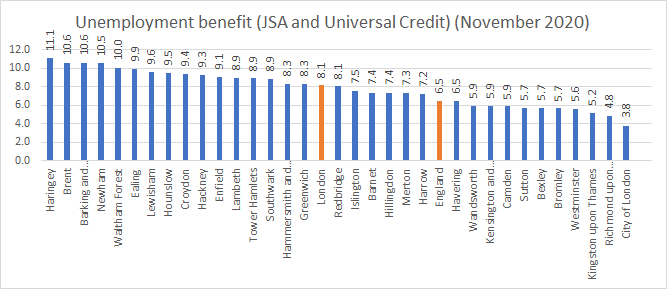
The unemployment rate across London is 8.1% which equates to roughly 491,300 people being currently unemployed.
This is higher than the unemployment rate for England at 6.4%.
At 11.1% Haringey has the highest rate of unemployment of any of the boroughs across London, followed by Brent and Barking and Dagenham, both at 10.6%. Whereas Kingston upon Thames, Richmond and City of London are seeing much lower rates of unemployment.
|
Ward |
Borough |
Unemployment rate (%) Nov-20 |
|
Northumberland Park |
Haringey |
17.0 |
|
Stonebridge |
Brent |
15.8 |
|
Harlesden |
Brent |
15.7 |
|
Bruce Grove |
Haringey |
14.7 |
|
Golborne |
Kensington and Chelsea |
14.3 |
|
Selhurst |
Croydon |
14.3 |
|
Tottenham Green |
Haringey |
13.9 |
|
Peckham |
Southwark |
13.5 |
|
White Hart Lane |
Haringey |
13.5 |
|
Lansbury |
Tower Hamlets |
13.2 |
The table above shows the 10 wards in London with the highest unemployment rates as of November 2020. Each of these areas have unemployment rates at more than double the national average.
Northumberland Park in Tottenham in Haringey has the highest unemployment rate in the capital with 17% of working age people unemployed. A further three wards in Haringey (all in neighbouring areas of Tottenham) feature in the top 10.
Additionally two areas of Brent and one each from Kensington and Chelsea, Croydon, Southwark and Tower Hamlets feature among the top 10.
Drilling down to ward level reveals inequalities in unemployment within boroughs. For example, Kensington and Chelsea as a whole has an unemployment rate that is below the national average. However, it contains a neighbourhood Golbourne - in North Kensington which is among the top 5 areas of London with the highest unemployment rate.
Youth unemployment
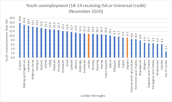
The youth unemployment rate across London is 10.9% which equates to roughly 81,770 young people being currently unemployed. This is higher than the unemployment rate for England at 9.2%
At 15.8% Croydon has the highest rate of youth unemployment of any of the boroughs across London, followed by Barking and Dagenham at 15% and Lewisham at 14.5%, with Westminster, Camden and City of London seeing much lower rates of youth unemployment.
Particular demographic (age) factors can affect levels of youth unemployment. Most notably, areas with high levels of students tend to have relatively low levels of youth unemployment as a large proportion of the 18-24 year olds residing in the area will be studying and therefore not eligible for unemployment benefits. Camden would be a good example of this as it has a relatively large student population and one of the lowest youth unemployment rates.
Generally, areas that are attractive to younger professionals are likely to have relatively low levels of youth unemployment while those attracting older people and families (some suburban areas of London) would have relatively lower levels of older adult unemployment.
Unemployment since March 2020
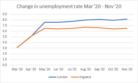
During 2020 we saw shocking unemployment statistics hit the headlines - including the largest single monthly increase in recorded unemployment – 850,000 new claimants across the UK - equal to an increase of 66% - between March and April.
There were sharp increases both across London and England as a whole. We can see that between April and May, the unemployment rate across London grew at a march sharper rate than England as a whole, before levelling out to some degree in May. The unemployment rate in London continues to be higher than the national average.
This suggests that the city as a whole has been more affected by the pandemic. Possible reasons for this include a high concentration of jobs in service sectors that have been particularly impacted by the lockdowns. We haven’t come across any academic explorations of why this might be the case beyond this - do let us know if you are aware of any research.
We can also look at the story across the different boroughs of London.
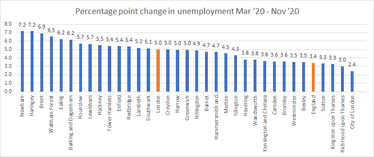
Here we are looking at ‘percentage point’ change - as this shows us where the biggest effects and impact of increased unemployment can be seen. So for example, Newham’s percentage point change is 7.2. In March the unemployment rate was 3.3%, we subtract this from the unemployment rate in November (which was 10.5%) to get the percentage point change - 7.2.
The advantage of ‘percentage point’ over percentage is that it measures the extent of the change equally for areas that had high unemployment and low unemployment in March. It is easier to get a big percentage change if your number was very small to start with. For example, an area that had an unemployment rate increase from 1% to 2% would have a bigger percentage increase than one that had unemployment increase from 4% to 7% even though a greater proportion of the workforce became unemployed over the period in the latter.
Newham and Haringey have seen the greatest percentage point change, both at 7.2, followed by Brent at 6.9.
It is interesting to note that central London areas seem to be less affected by increasing unemployment rates, with suburbs and areas on the fringes of Inner city London more affected.
Newham, Brent and Haringey are interesting as although they are relatively far from the centre of London, they have some of the characteristics of inner london boroughs (for example, high density populations, low owner occupation, transitory populations, ethnically diverse, high levels of deprivation).
Furloughing figures
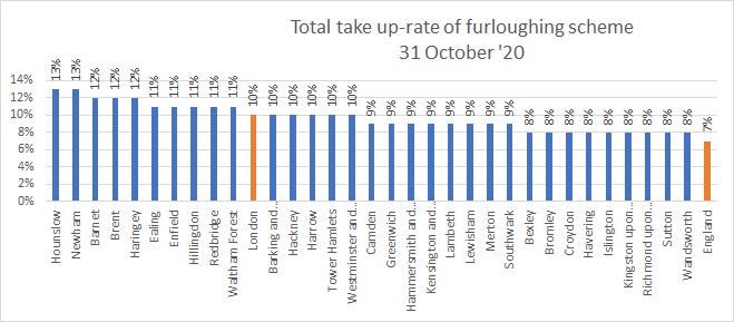
It is also worth noting that in addition to those individuals that are currently unemployed, there is also a sizeable proportion of people that are currently on furlough and out of work in that sense.
All boroughs in London fare higher than the national average on furloughing figures as of 31st October.
Although we have seen the proportion of people being furloughed falling steadily since the figures were first published on 31st July, it is not clear from the figures whether this is due to returning to work or due to job losses. In any case, employees that are currently on furlough may be in a more precarious position and face a greater risk of becoming unemployed.
Hounslow and Newham currently have the largest proportion of furloughed workers at 13%. In the case of Hounslow, this may be due to the proximity of Heathrow Airport - as with such a decline in international travel, many positions have been furloughed.
Explore unemployment data further
Local Insight gives you instant access to more than 1000 small area datasets, which are instantly matched to the areas you care about and visualised through maps, reports and dashboards.
You can then complement this with your own locally held data to inform decision making and plan services. Local Insight has a real focus on keeping things simple and easy to use, so that you don’t need to be a statistician to be able to access information about the communities you work in.
Sign up for a demo to find out more.
Contact

Datawise London is a partnership led by Superhighways at Kingston Voluntary Action.
If you are interested in finding out more about the project and its resources or would like to share your own data ideas and challenges please contact us.