
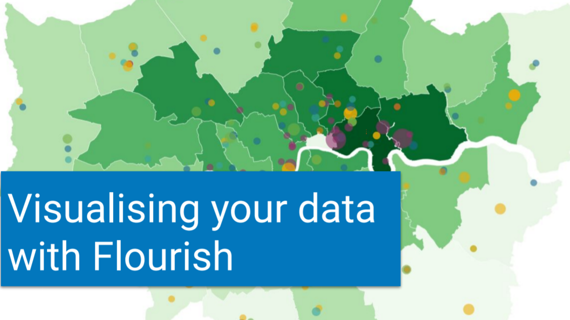
Thanks to David Kane, a freelance data scientist and researcher, specialising in data for, by and about charities and wider civil society, we recently held a session to learn more about the data visualisation tool Flourish.
David showed us a range of different visualisations that can be created, from charts and maps, to interactive stories and then demoed the tool, before leading us all through some exercises to have a go ourselves.
Missed the session?
Check out the recordings and resources from the session below to catch up!
An introduction to a range of data visualisations you can create with Flourish
Getting started creating a chart
Getting started creating a map
Download the presentation slides here
Contact

Datawise London is a partnership led by Superhighways at Kingston Voluntary Action.
If you are interested in finding out more about the project and its resources or would like to share your own data ideas and challenges please contact us.