Young Brent Foundation equips its members with the training, resources and financial support they need to ensure children and young people in the borough have access to the quality support and opportunities they need to thrive.
We talked to Maxine Willetts, Chief Operating Officer, about how data visualisation techniques, learned with the help of Datawise London, have illuminated the work of children and young people’s organisations in Brent.
Challenge: Communicating complex data
What was Maxine’s data challenge we asked?
“I love that but it is a massive question, isn't it? There's having it, and then knowing what to do with it and also just keeping it simple.
Especially over the past 18 months: we've all been so bombarded with information that we wanted to just communicate really simply some of the work that our members do".
Young Brent Foundation works with over 200 youth organisations delivering services in Brent. Some are based in Brent and others work across London.
“We often have, social workers, children’s workers, and local authority officers wanting to know where they can find information about the members, what sort of theme areas that they work in and where roughly they're located.
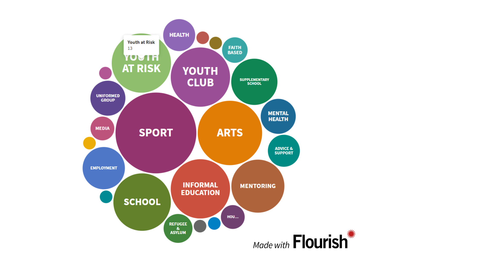
They want to know the answers to questions such as “Are they delivering sport or art? Do they welcome young people who are at risk? Are they a supplementary school?”
“There are also lots of challenges around getting information onto websites, especially if you're not familiar with website building. We have access to the back end of our website, but we just upload written narrative content.”
Solution
Maxine attended ‘An introduction to visualising your data with Flourish’ that introduced her to this online tool and others, such as Community Lens, that help communicate data stories.
She found Flourish quick to learn, using an Excel template in the tool to map their data to, including essential information such as organisation name, postcode and what type of services they offer.
Using the iframe that Flourish offers, Maxine then embedded the interactive bubble map on Young Brent Foundation’s website.
Here's a preview of the map:
Explore the interactive map on the Young Brent Foundation website.
How training / advice helped
“It gave me an opportunity to look at how we see visually and how we use that information very quickly visually, which allows people to investigate further.
All the Members that we work with just want to find very quick, snappy information that allows them to interact.
I wasn't aware of anything out there that would be free.
The training helped show where I could put that code in so it would come up on our website. So that was again a massive benefit”.
How useful has Flourish been for Young Brent Foundation?
“It was just a game changer, really.
I trained as a social worker many moons ago and I got into fundraising through that work because essentially, as a social worker, my main role was resources.
So families needed furniture. They needed income, so making sure they had the right benefits. They needed connections with people if they were away from their families.
And when I moved into doing fundraising, it's exactly the same principle. People need resources.
For Maxine, being able to communicate complex information is the future of great partnerships.
It's having people who can be the magpies, and gather things and then filter that into something that's accessible to another group of people. I think that's going to be the key strength of organisations working collaboratively.
I think that, for me, is worth so much in terms of feeling great about the work that I do
It also helps people think through what isn't there as well, and that opens up conversations”.
She feels Datawise London training has been a space to meet like-minded people.
“It was great being part of a community that understands the nuances of being in a charity, and the different sort of journeys that people come through to working in charities”.
Key take aways
"Slowly and surely there are smaller organisations who understand that data is now part of our everyday. It's not a separate topic, it doesn't sit with the person who loves collecting information and the office. It's not part of the library system, you know, all those ideas that we have about data.
Obviously, over the past 18 months it's just changed.
So it's part of our normal, everyday”.
And how does it feel being able to communicate with data using tools such as Flourish?
“Personally, for me it's anything where I feel I'm making it easier for someone to find information. And I always feel that that's when I'm at my best because I know that it costs people time, in terms of knowing what's available, being efficient and so on.
At any point where I can make someone's life easier in terms of finding a resource, for me, that's the gold.
Next steps: putting learning into action across communications
Maxine has already used a different card format in Flourish to create a rolling banner of the Young Brent Foundation team, showing job titles and key passion.
“It just gives people who were searching a who’s who in the team. A little flavour of what they enjoy about being a part of the team, but also a visual as well.
I'm constantly thinking of new ways to share. I used the same card format to show some organisations that have been funded to deliver particular programs as well”.
Maxine has also created 1-sided reports for the trustee board so that they can see what’s happening with membership, together with using Power BI for further analysis.
“When I've got some time to create a new visualization, I definitely will. It's an ongoing thing”.
Contact

Datawise London is a partnership led by Superhighways at Kingston Voluntary Action.
If you are interested in finding out more about the project and its resources or would like to share your own data ideas and challenges please contact us.

