Written by Nissa Ramsay for Datawise London
This month we’ve been trialling a new training session to provide an introduction to qualitative data analysis. We know from our data journeys research that qualitative data is a key swamp, or sticking point, for small charities. It is hard to develop new skills in this area and determine the best tools and methods to use for analysis.
Here, we want to share our top tips to help you get started with analysing qualitative data. For example, the quotes in Table 1 are taken from a data set created for a fictitious charity project called Music Mentors, providing volunteer music lessons for people in prison. The fictitious organisation and training materials are based on a real life case study.
We hope it helps you to:
- Think about the nature of your qualitative data
- Gain ideas for how to get started with analysis and light touch approaches
- Understand how you could analyse qualitative data systematically
- See how everyday digital tools and specialist tools can help with analysis
- Make a plan for your analysis
We collect qualitative data when we ask people open questions about their experiences, views and behaviours. We might gather this from interviews, case studies, open-ended survey questions and feedback forms, social media posts or quotes. As a result, we don’t always know exactly what we are going to hear in response.
This is distinct from quantitative data, where questions have predefined closed responses (think tick boxes in a survey) or where we count and quantify people’s activities and behaviours. Quantitative data is fantastic for helping us measure and compare trends. This helps us understand what is happening or what people think. It cannot help us fully understand why.
Qualitative data helps us to fill gaps in our knowledge about patterns in people’s experiences, motivations, behaviours and lives. It helps us find out what is important to participants (rather than what we think is important to them). We can use this to generate new insights (rather than quantifying what we already know).
The ‘open’ nature of qualitative data can often feel nebulous, overwhelming or messy. We undertake analysis to help us organise our data and in doing so, identify patterns, themes, and insights.
This starts with a process called coding. At its most basic, this is a process of organising our qualitative data (in the form of text). It has nothing to do with the type of coding that creates websites (although we often use digital tools to help us). Instead, it is a process of labelling text, putting it into meaningful groups. This helps us find, understand and compare what is in each group.
Think about how you organise aspects of your home, such as your cutlery drawer, children’s toys or clothes in your wardrobe. Everything has a ‘place’ and the containers help you visually label what you expect to put in there and find in there (in an ideal world).
Coding is similar. You create and then assign short labels (codes) to segments of text. You decide what the codes should be. You also decide how simple or sophisticated you want to make this process. Returning to our toy example, you might want one big box, or you might want lots of smaller boxes within it.
A key first step to developing your codes is to familiarise yourself with the data. This involves reading through your text (or a sample of it) in order to identify potential themes, codes and insights:
- Start to spot common words and phrases
- Can you visually spot any common topics?
- Are there any differences of opinion?
- Do you have any groups you want to compare?
You can then start to develop a set of codes. These might be descriptive (summarising what is in there) or interpretative (linking to key concepts in your work or explaining deeper meanings), depending on the data you are looking at.
For example, the quotes in Table 1 are taken from [xxxx]. We will build on this example throughout the blog post.
As we read the quotes in Figure 1, we can see that the word ‘instruments’ appears frequently, as well as ‘piano’ and ‘drums’. These have been highlighted in blue to show these are tagged to the code of ‘instruments’. We can also see references to noise, heating and smell of the rooms. These are highlighted in purple to give them the code of ‘venue’.
Figure 1: Feedback quotes with highlighting to allocate a code
| Ref | What do you think would improve the sessions? |
| 1 | More instruments |
| 2 | Less people in the group, the mentors don't have enough time to spend with everyone |
| 3 | More drums, better heating in the winter, sessions at the weekend |
| 4 | Too much noise from the courtyard |
| 5 | Longer sessions |
| 6 | My welfare officer told me I couldn't attend anymore |
| 7 | Weekly sessions, once a month isn't enough |
| 8 | The room we practice in is next to the rubbish bins, in summer it stinks |
| 9 | More choice of instruments & a mentor who knows how to play drums |
| 10 | We need a piano! |
| 11 | The heating has broken again & could we get drums? |
Codes applied:
- Instruments (references to more instruments, drums and pianos)
- Venue (references to the room, heating, smell)
This short example shows how you can develop codes by looking at your data. This is also called descriptive or ‘bottom up’ coding, because it is based directly on the contents of the text based data.
You can also take a ‘top down’ coding approach, where you decide in advance what you are looking for, based on your research questions and context. For example, if you have asked for people’s feedback about a service, you may also know you are looking to find out about people’s experiences in relation to specific aspects (for example, the mentors).
Once you have an initial set of codes, you then need to apply them consistently to your dataset. Ideally, you want 5 - 10 codes to break up your data. However, this will depend on how much data you have and the variety of views expressed.
This is an iterative process. In other words, as you apply your codes, you may want to revise your list of codes and re-apply them.
- Add additional or new codes: If you have a code that you use more frequently, you may benefit from looking at the text to develop further codes which can break it down. This will help if you identify further patterns in the data.
- Merge or delete codes: If you have codes that are rarely used, often used at the same time or are conceptually similar. Returning to our example above, ‘drums’ and ‘piano’ could be coded together as ‘instruments’ (rather than separately as individual codes). However, be careful here as lesser-used codes may highlight an important difference of opinion or experience.
During the process of coding, you will be identifying patterns. You can then look at the quotes for each code and summarise what is discussed. These are your insight statements because they describe:
- Common experiences or feelings
- Which topics are discussed most or least
- How those topics are discussed
- Any clear differences of opinion/experiences
- Any clear differences between specific groups of respondents
Returning to Table 1, we can already see that the feedback highlights the urgent need for a more suitable venue and further investment in the instruments available (especially the drums and piano).
Tip: Always document what your codes mean and what they include / exclude (and keep this updated). This makes your analysis process more systematic, because you have a clear method you have applied.
Spreadsheets
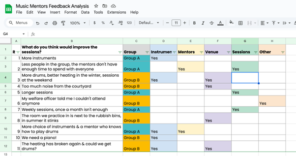
A spreadsheet can be ideal for coding data in short open responses. Figure 2 below (you can also find this online here) shows how our example above (in Table 1) can be coded using a spreadsheet. Here we have:
- A column for each code, with a simple ‘Yes’ to apply the code. This allows for multiple codes to be applied to the same quote.
- Colour coding (conditional formatting function), to visually help us see which codes are used the most and where there are overlaps.
- Filtering option, so we can look at the quotes for a specific code.
- A new column to indicate which group of participants the feedback relates to (column H, called ‘group’); this can be filtered to see differences.
Figure 2: Coding using a spreadsheet. Access this online as a Google Sheet here.
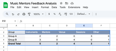
We can also use advanced features of spreadsheets to support our analysis. Figure 3, for example, shows a pivot table, which provides a count of the number of times each code has been used overall, as well as for the two different groups.
This can help us quantify our qualitative data, helping us see which codes are used most and, therefore, which issues are most important to participants.
Figure 3: Using a pivot table to quantify qualitative data
A whiteboard
An online whiteboard is a visual canvas, where users can add and store text, images, shapes, sticky notes, and diagrams. It is much like on a physical whiteboard but with enhanced tools and features.
Examples include Miro, Mural and Freeform (Freeform is only available on Apple). Many have a free version and you can use the infinite size to hold multiple projects, or export the results to excel and image files when you have finished a project.
They are ideal if you are a visual thinker and for collaborating on qualitative data analysis. Working together as a team to code data will bring different perspectives and give you all more confidence in your findings.
Pro Cymru’s Guide to synthesising user interviews also shows how you can similarly use paper post-it notes on a wall or table (the Post-it App can transcribe this for you!)
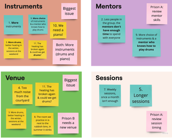
Figure 4 uses the quotes from our earlier example and shows how an online whiteboard (Miro) can be used for coding. This process involved:
- Adding each quote to a sticky note on a whiteboard canvas
- Colour coding each sticky note to show which group they are from
- Creating a box (called a frame) with a title for each code
- Adding the relevant quotes on sticky notes to each frame
- Adding pink sticky notes and writing reflections / actions
Figure 4: Using an online whiteboard to code and analyse qualitative data
Specialist tools are particularly helpful when you have a lot of data, time, and budget for qualitative data analysis. They tend to be geared towards interview data, because they help condense vast amounts of text.
Using these tools may help you learn more about coding and encourage you to do this systematically.
Tools such as Nvivo, ATLAS.ti and MaxQDA are well established to help you code your data and visualise your codes. However, these tools can be expensive for small charities and may be time consuming to learn.
The free trials and introduction videos will give you a strong idea as to whether they will be useful for your project and organisation. You could also consider signing up for a short subscription during an analysis phase and exporting your analysis reports.
Quirkos is also worth considering because it offers a user-friendly approach to coding qualitative data. It is a specialist qualitative data analysis tool designed to make organising and visualising text data simple and intuitive.
Users import data (like interview transcripts on documents or survey responses in spreadsheets), then drag and drop sections of text into "bubbles" on the screen that represent different themes or codes.
The size of these bubbles grows as more data is coded to them, providing a visual representation of key themes (which can also be presented to others). This is demonstrated in their introduction video below.
You’ll have seen throughout this post that analysing qualitative data can involve a range of intricate, manual and time-consuming tasks.
AI tools can be incredibly helpful here, as long as they are used to complement (rather than replace) your own knowledge and interpretation. These tools use algorithms and machine learning to automate processes.
They are particularly helpful for transcription, identifying common words, providing basic summaries of discussions and generating ideas for report outlines.
Specialist qualitative data analysis tools are also starting to integrate AI technology to save time and simplify analysis.
Examples of how AI tools can help with qualitative data analysis:
- Otter.Ai is an AI-powered transcription tool that automatically converts audio files of spoken content into written text. It can allocate speaker names and more recently, and can provide a summary of the discussion.
- CoLoop is an Ai based qualitative data analysis tool, which has a chat function to ask questions about your data and what you can learn from it.
- Nvivo and MaxQDA can automatically suggest and allocate codes based on frequently occurring terms and phrases (see this blog post).
- ATLAS.ti uses AI to assess the tone of responses to identify if they are positive, negative, or neutral (this is called sentiment analysis) and can help understand the general mood and emotions in text.
- ChatGPT and Claude are AI tools which are designed to understand and produce human-like text responses. They allow users to enter data and write prompts to ask questions about it. These can be used as part of the analysis process. For example, they can create summaries, identify themes in text, brainstorm ideas and draft reports.
Before using any AI tools or functionality please consider:
- Is it ethical and responsible? Think about your participants and research subject, as well as how comfortable you are with AI tools learning from this data (for some tools, you can turn this feature off). You may want to discuss this with your team, as well as including it in your consent form and privacy policy. There is potential for bias and discrimination in how AI tools interpret data. Always get to know your data and sense check results.
- Does it align with your environmental practices? AI tools can be harmful to the environment and it’s important your organisation understands this.
- Is it helpful? Consider how much interpretation and knowledge of your context and work is needed to make sense of the data.
- Does it fit with your GDPR policy? Look at the privacy policy for the tool and your organisation (or ask your Data Protection Officer) to check for any differences (especially where the data is processed and stored).
- Do you have sensitive or personal data? Never use AI with any personal, sensitive or identifiable data (such as location, your organisation).
- Are you confident in your skills and data? To get the most out of these tools, you need to be confident with using prompts to correct responses. You need to be very familiar with your data and the context to ensure the interpretation is accurate and meaningful.
Before you jump in and start analysing your data, we recommend that you make a plan for your analysis. We have created a template you can use in Figure 5 to set out your next steps, helping you plan and document your analysis process. A key first step is to be clear about your research purpose and research questions. We’ll provide more detail here to help you get started.
Your research purpose
This is a set of statements about why you are undertaking the analysis and what you hope will change as a result. You may have done this before (or it may seem obvious), but it is important to revisit your purpose so that you can:
- Stay focused (especially when you have a lot of data or varied responses)
- Prioritise which findings to focus on and share
- Communicate why the analysis is important to others
- Check you have a clear rationale for analysing this data
If you aren’t clear about why you need the insights and how you will act on them, you might want to reconsider whether the analysis is necessary.
Your research questions
You also need a set of research questions (typically 3 to 5 questions), which provide more detail about what you hope to find out from the analysis. These frame why you asked questions of participants and what you will find out specifically by analysing their responses. They usually focus on people, problems or service experience. Examples include:
- What are people’s motivations for coming to us for help?
- What problems do our volunteers experience when trying to volunteer for our organisation?
- What are the barriers to using our service?
- What do people do as a result of using our service?
- What issues are emerging in our borough, according to our clients?
- Why are people dropping out of our service?
As you can see from this list, they are not the same as your interview or survey questions, but they are often related (see this blog post). For example, Superhighways sends a feedback form to everyone who takes part in their training sessions that includes the following open questions:
- Do you have any suggestions to improve the content, delivery or format of the training?
- What one action will you take as a result of attending the session?
- Is there any further tech, digital or data training or support that would be useful to you?
- How will this session better help you use data in your work? We’d particularly like to hear about examples of using data to influence change.
The purpose of analysing this data could be:
- To conduct an annual review of training and support, in order to make improvements to training sessions and to identify gaps in training.
In this context the research questions could be:
- What improvements do participants suggest to training sessions?
- What are the gaps in participants skills and knowledge?
- Are there emerging needs for training or support this year?
- How are participants benefiting from our training?
- How does our training benefit organisations and the impact they have?
You will hopefully now have a clear idea about what qualitative analysis involves, the tools you can use and how to frame your research questions. We hope you can now make a plan for your analysis and get started! We’d love to hear how you get on. Please contact us at Superhighways to share any challenges and learning from using any of the tools or methods we suggested.
Figure 5: Qualitative Data Analysis Planning Template
| Analysis purpose |
|
| Your research questions (3-5) |
|
| Describe your data |
|
| Analysis approach |
|
| Informed consent |
|
| Data logistics, safety and security |
|
| Collaboration |
|
| Keeping participants involved |
|
| Challenges and next steps |
|
If you would like us to run this session for your organisation or network, please contact us on info@superhighways.org.uk
We'd also be happy to share the session plan and resources for you to run yourselves. Just let us know and we can discuss further.
Contact

Datawise London is a partnership led by Superhighways at Kingston Voluntary Action.
If you are interested in finding out more about the project and its resources or would like to share your own data ideas and challenges please contact us.


